Challenge
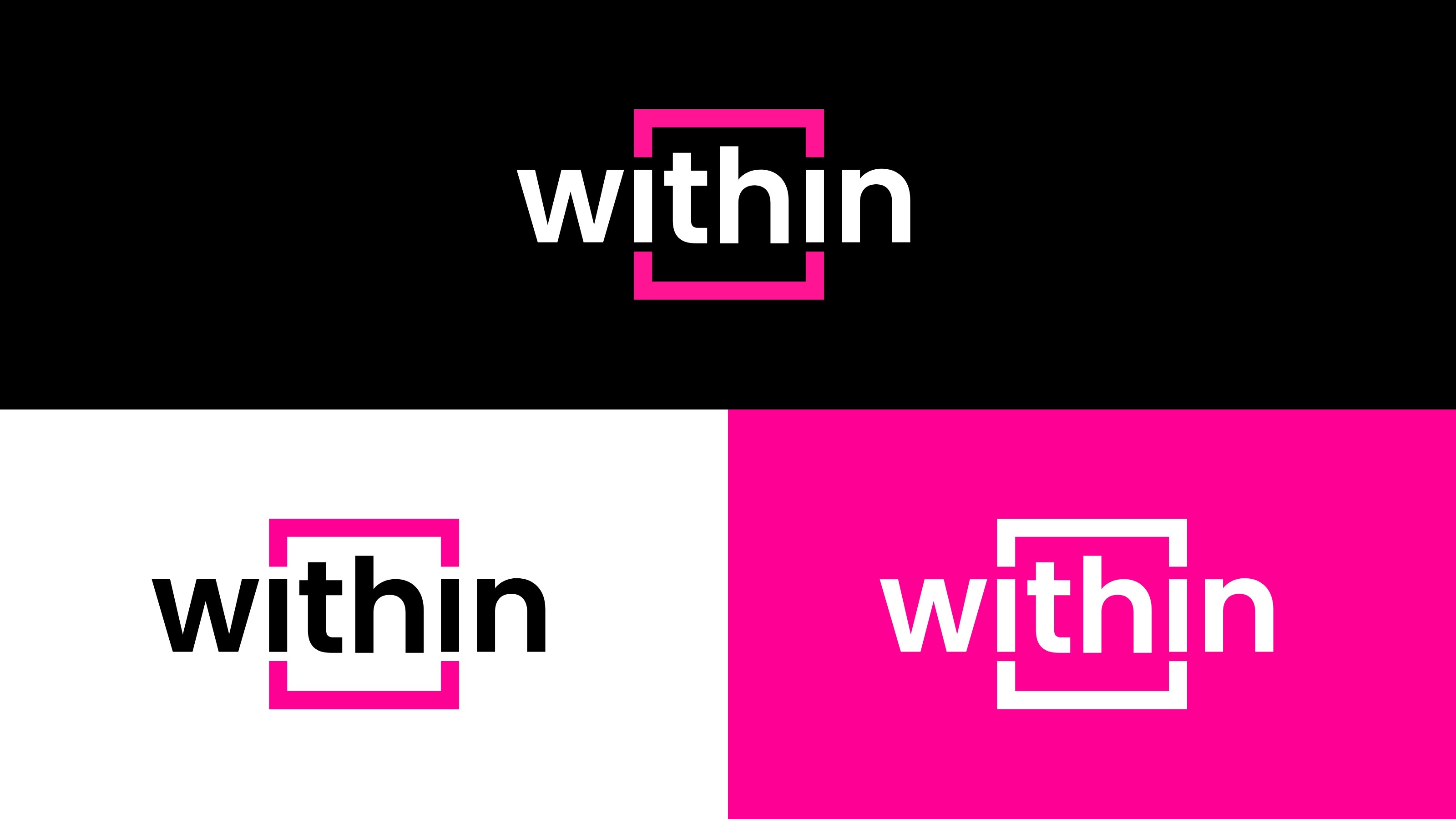
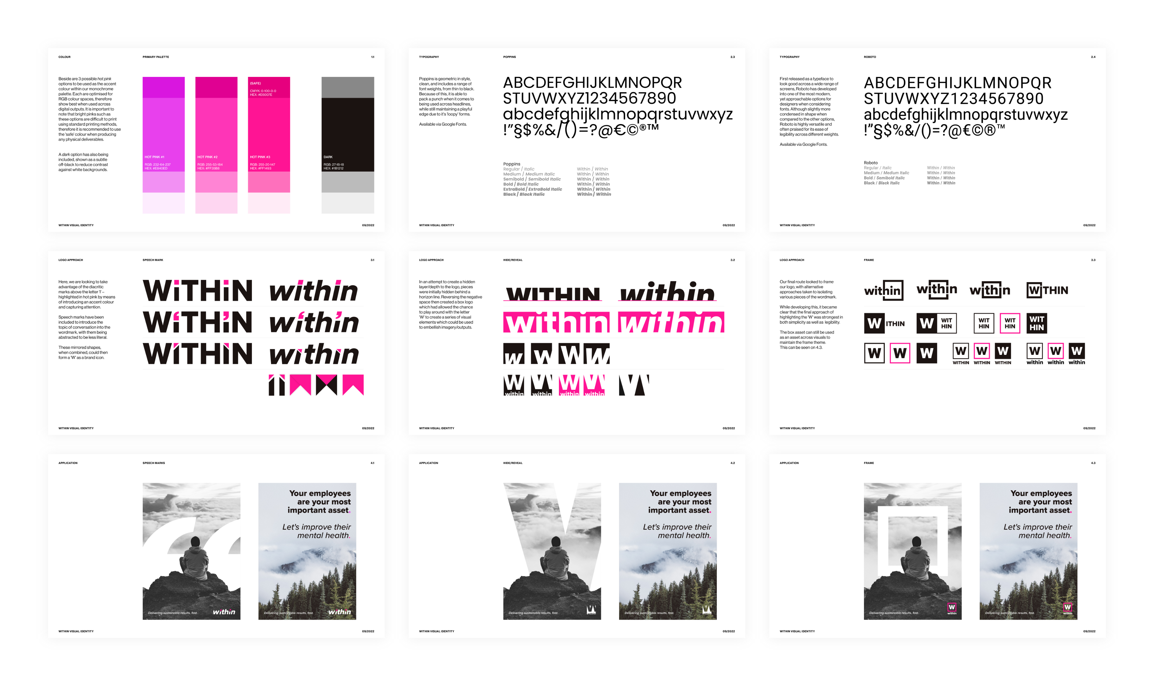
A bold approach was taken into the initial design explorations in order to reflect the personality that the business required. This was driven by the selection of a monochrome + hot pink colour palette, partly as a nod to the relationship that WITHIN has with Talk for Health, but more to represent the brand’s simple, straight and digital first tonality and to separate it from an already congested space.
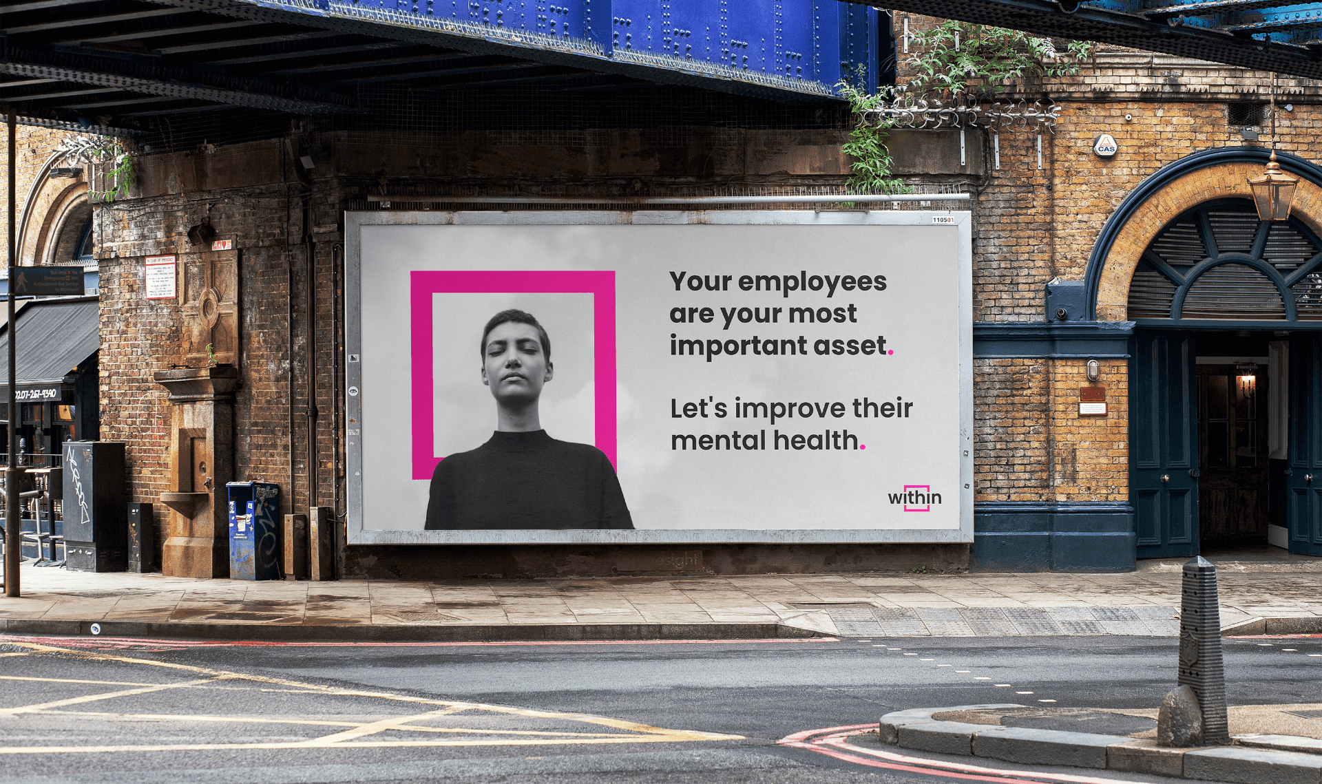
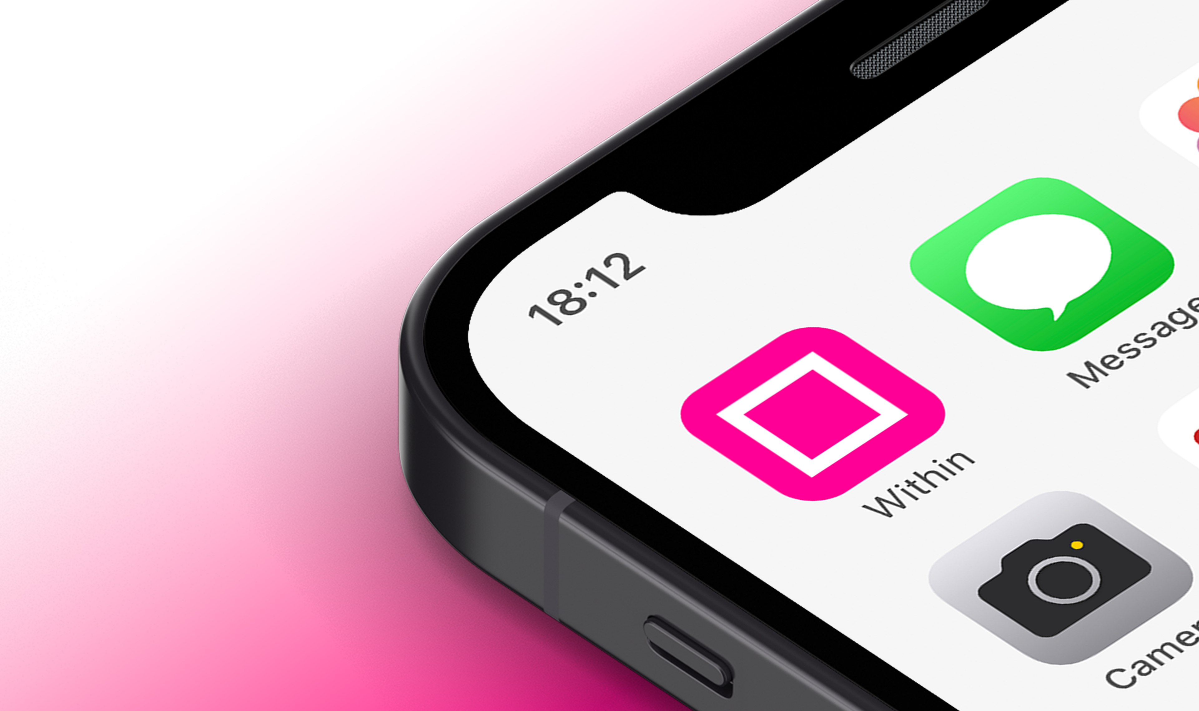
Visual routes experimented with the application of speech marks and creating depth through the use of negative space before settling on a frame element to reflect the sense of trust and the safe group that the programme creates. This was utilised in both primary logo as well as a consistent visual asset to frame various subjects/spaces across marketing materials.
Solution
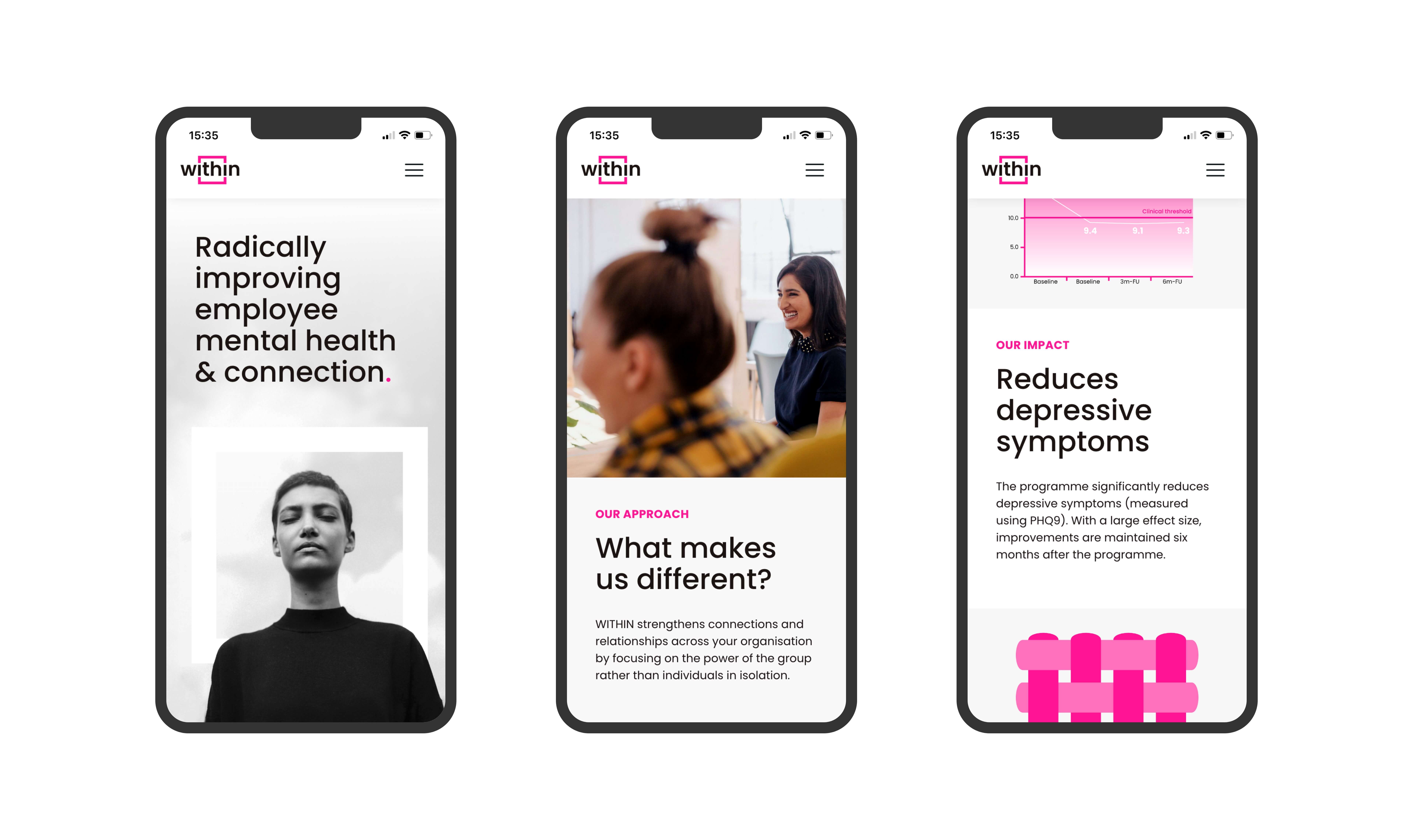
The WITHIN brand identity was developed to champion a strong, human voice and provide a point of difference in the mental health and start up category. In order to maintain consistent application, foundation assets were packaged with introductory guidelines, image approaches and further guidance on translating this across both physical and digital channels.
WITHIN was announced and launched in early 2023, and have since begun their mission to empower people to support themselves and each other through meaningful human interaction.